# Run this cell to set up packages for lecture.
from lec26_imports import *

# Don't worry about how this code works.
def pred_interval(mom):
    plt.figure(figsize=(8,4))
    x = np.arange(50, 80)
    ys = []
    for i, (m, b) in enumerate(zip(m_boot[:50], b_boot)):
        ys.append(m * x + b)
        plt.plot(x, m * x + b, linewidth=1, alpha=0.1)

    boot_preds = m_boot * mom + b_boot
    l = np.percentile(boot_preds, 2.5)
    r = np.percentile(boot_preds, 97.5)
    plt.plot([mom, mom], [l, r], linewidth=5, color='#eb7e35', label='95% prediction interval')
    plt.xlim(50, 80)
    plt.ylim(62, 77)
    plt.title(f'95% prediction interval for the height of a son whose mother is {mom} inches tall: {[np.round(l, 3), np.round(r, 3)]}')
    plt.legend()
    plt.show()

def slider_widget():
    mom_slider = widgets.IntSlider(value=64, min=50, max=78, step=1, description="mom's height")
    ui = widgets.HBox([mom_slider])
    out = widgets.interactive_output(pred_interval, {'mom': mom_slider})
    display(ui, out)
Announcements
- Discussion 9 is today at 4PM, 5PM, and 7PM.
- The Final Project is due tomorrow at 11:59PM.
- You can use slip days if needed.
- If one or both partners has run out of slip days and you submit the project late, we will reallocate slip days towards the final project, away from lesser-weighted assignments. See the syllabus for more details.
- In addition to submitting the Jupyter notebook (.ipynb file), you'll also need to submit a PDF of your notebook. There will be two separate Gradescope submissions for the two different file types; please submit to both!
- Lab 7 is due on Thursday at 11:59PM.
- Even if you don't need to do this lab for your grade, it's the only assignment on regression, which will be tested on the Final Exam.
Announcements
- The Final Exam is this Saturday, December 7th from 11:30AM-2:30PM.
- See this announcement for more details.
- Last chance for participation points:
- Earn 1 participation point by filling out both SETs and the internal End-of-Quarter Survey before 8AM on Saturday.
- Thank you! We value your feedback.
- Please finish the final project before taking the survey.
- Today is the last day of new material. The next two days are for review!
- We'll be working through the Spring 2024 Final Exam on Wednesday. Before then, try printing out this PDF and taking the exam under realistic exam conditions.
Agenda
- Residuals.
- Inference for regression.
Residuals
The regression line is the best line!
- It turns out that the regression line $y=mx+b$, with $m$ and $b$ as defined below, minimizes the root mean squared error (RMSE) among all lines.
$$m = r \cdot \frac{\text{SD of } y}{\text{SD of }x}$$
$$b = \text{mean of } y - m \cdot \text{mean of } x$$
- It is the best line, regardless of what our data looks like!
- All equivalent names:
- Line of “best fit”.
- Least squares line.
- Regression line.
Quality of fit
- The regression line describes the "best linear fit" for a given dataset.
- The formulas for the slope and intercept work no matter what the shape of the data is.
- However, the line is only meaningful if the relationship between $x$ and $y$ is roughly linear.
Example: Non-linear data
non_linear()

This line doesn't fit the data at all, despite being the "best" line for the data!
Residuals
- Any set of predictions has errors.
$$\text{error} = \text{actual } y - \text{predicted } y$$
- When using the regression line to make predictions, the errors are called residuals.
$$\text{residual} = \text{actual } y - \text{predicted } y \text{ by regression line}$$
- There is one residual corresponding to each data point $(x, y)$ in the dataset.
def predicted(df, x, y):
    m = slope(df, x, y)
    b = intercept(df, x, y)
    return m * df.get(x) + b

def residual(df, x, y):
    return df.get(y) - predicted(df, x, y)
Example: Predicting a son's height from his mother's height 👵👨 📏
Is the association between 'mom' and 'son' linear?
- If there is a linear association, is it strong?
- We can answer this using the correlation coefficient.
- Close to 0 = weak, close to -1/+1 = strong.
- Is "linear" the best description of the association between
'mom'and'son'?- We'll use residuals to answer this question.
galton = bpd.read_csv('data/galton.csv')

male_children = galton[galton.get('gender') == 'male']
mom_son = bpd.DataFrame().assign(mom = male_children.get('mother'),
                                 son = male_children.get('childHeight'))

mom_son_predictions = mom_son.assign(predicted=predicted(mom_son, 'mom', 'son'),
                                     residuals=residual(mom_son, 'mom', 'son'),
                                    )

plot_regression_line(mom_son_predictions, 'mom', 'son', resid=True)
Correlation: 0.3230049836849053

Residual plots
The residual plot of a regression line is the scatter plot with the $x$ variable on the $x$-axis and residuals on the $y$-axis.
$$\text{residual} = \text{actual } y - \text{predicted } y \text{ by regression line}$$
- Residual plots describe how the error in the regression line's predictions varies.
- Key idea: If a linear fit is good, the residual plot should look like a patternless "cloud" ☁️.
mom_son_predictions.plot(kind='scatter', x='mom', y='residuals', s=50, c='purple', figsize=(10, 5), label='residuals')
plt.axhline(0, linewidth=3, color='k', label='y = 0')
plt.title('Residual plot for predicting son\'s height based on mother\'s height')
plt.legend();

The residual plot for a non-linear association 🚗
- Consider the hybrid cars dataset from earlier.
- Let's look at a regression line that uses
'mpg'to predict'price'.
hybrid = bpd.read_csv('data/hybrid.csv')
mpg_price = hybrid.assign(
    predicted=predicted(hybrid, 'mpg', 'price'),
    residuals=residual(hybrid, 'mpg', 'price')
)
mpg_price
| vehicle | year | price | acceleration | mpg | class | predicted | residuals | |
|---|---|---|---|---|---|---|---|---|
| 0 | Prius (1st Gen) | 1997 | 24509.74 | 7.46 | 41.26 | Compact | 32609.64 | -8099.90 |
| 1 | Tino | 2000 | 35354.97 | 8.20 | 54.10 | Compact | 19278.39 | 16076.58 |
| 2 | Prius (2nd Gen) | 2000 | 26832.25 | 7.97 | 45.23 | Compact | 28487.75 | -1655.50 |
| ... | ... | ... | ... | ... | ... | ... | ... | ... |
| 150 | C-Max Energi Plug-in | 2013 | 32950.00 | 11.76 | 43.00 | Midsize | 30803.06 | 2146.94 |
| 151 | Fusion Energi Plug-in | 2013 | 38700.00 | 11.76 | 43.00 | Midsize | 30803.06 | 7896.94 |
| 152 | Chevrolet Volt | 2013 | 39145.00 | 11.11 | 37.00 | Compact | 37032.62 | 2112.38 |
153 rows × 8 columns
# Plot of the original data and regression line.
plot_regression_line(hybrid, 'mpg', 'price');
print('Correlation:', calculate_r(hybrid, 'mpg', 'price'))
Correlation: -0.5318263633683786

# Residual plot.
mpg_price.plot(kind='scatter', x='mpg', y='residuals', figsize=(10, 5), s=50, color='purple', label='residuals')
plt.axhline(0, linewidth=3, color='k', label='y = 0')
plt.title('Residual plot for regression between mpg and price')
plt.legend();

Note that as 'mpg' increases, the residuals go from being mostly large, to being mostly small, to being mostly large again. That's a pattern!
Issue: Patterns in the residual plot
- Patterns in the residual plot imply that the relationship between $x$ and $y$ may not be linear.
- While this can be spotted in the original scatter plot, it may be easier to identify in the residual plot.
- In such cases, a curve may be a better choice than a line for prediction.
- In future courses, you'll learn how to extend linear regression to work for polynomials and other types of mathematical functions.
Another example: 'mpg' and 'acceleration' ⛽
- Let's fit a regression line that predicts
'mpg'given'acceleration'. - Let's then look at the resulting residual plot.
accel_mpg = hybrid.assign(
    predicted=predicted(hybrid, 'acceleration', 'mpg'),
    residuals=residual(hybrid, 'acceleration', 'mpg')
)
accel_mpg
| vehicle | year | price | acceleration | mpg | class | predicted | residuals | |
|---|---|---|---|---|---|---|---|---|
| 0 | Prius (1st Gen) | 1997 | 24509.74 | 7.46 | 41.26 | Compact | 43.29 | -2.03 |
| 1 | Tino | 2000 | 35354.97 | 8.20 | 54.10 | Compact | 41.90 | 12.20 |
| 2 | Prius (2nd Gen) | 2000 | 26832.25 | 7.97 | 45.23 | Compact | 42.33 | 2.90 |
| ... | ... | ... | ... | ... | ... | ... | ... | ... |
| 150 | C-Max Energi Plug-in | 2013 | 32950.00 | 11.76 | 43.00 | Midsize | 35.17 | 7.83 |
| 151 | Fusion Energi Plug-in | 2013 | 38700.00 | 11.76 | 43.00 | Midsize | 35.17 | 7.83 |
| 152 | Chevrolet Volt | 2013 | 39145.00 | 11.11 | 37.00 | Compact | 36.40 | 0.60 |
153 rows × 8 columns
# Plot of the original data and regression line.
plot_regression_line(accel_mpg, 'acceleration', 'mpg')
print('Correlation:', calculate_r(accel_mpg, 'acceleration', 'mpg'))
Correlation: -0.5060703843771186

# Residual plot.
accel_mpg.plot(kind='scatter', x='acceleration', y='residuals', figsize=(10, 5), s=50, color='purple', label='residuals')
plt.axhline(0, linewidth=3, color='k', label='y = 0')
plt.title('Residual plot for regression between acceleration and mpg')
plt.legend();

Note that the residuals tend to vary more for smaller accelerations than they do for larger accelerations – that is, the vertical spread of the plot is not similar at all points on the $x$-axis.
Issue: Uneven vertical spread
- If the vertical spread in a residual plot is uneven, it implies that the regression line's predictions aren't equally reliable for all inputs.
- This doesn't necessarily mean that fitting a non-linear curve would be better; it just impacts how we interpret the regression line's predictions.
- For instance, in the previous plot, we see that the regression line's predictions for cars with larger accelerations are more reliable than those for cars with lower accelerations.
- The formal term for "uneven spread" is heteroscedasticity.
Example: Anscombe's quartet
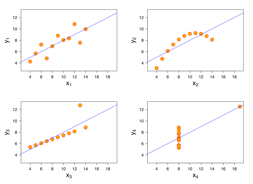
- All 4 datasets have the same mean of $x$, mean of $y$, SD of $x$, SD of $y$, and correlation.
- Therefore, they have the same regression line because the slope and intercept of the regression line are determined by these 5 quantities.
- But they all look very different! Not all of them contain linear associations.
Example: The Datasaurus Dozen 🦖
dino = bpd.read_csv('data/Datasaurus_data.csv')
dino
| x | y | |
|---|---|---|
| 0 | 55.38 | 97.18 |
| 1 | 51.54 | 96.03 |
| 2 | 46.15 | 94.49 |
| ... | ... | ... |
| 139 | 50.00 | 95.77 |
| 140 | 47.95 | 95.00 |
| 141 | 44.10 | 92.69 |
142 rows × 2 columns
calculate_r(dino, 'x', 'y')
-0.06447185270095163
slope(dino, 'x', 'y')
-0.10358250243265595
intercept(dino, 'x', 'y')
53.452978449229235
plot_regression_line(dino, 'x', 'y');

Takeaway: Never trust summary statistics alone; always visualize your data!
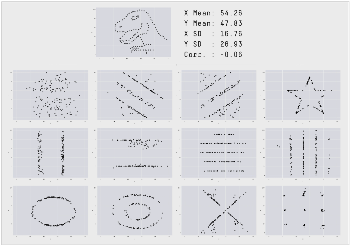
(source)
Inference for regression
Another perspective on regression
- What we're really doing:
- Collecting a sample of data from a population.
- Fitting a regression line to that sample.
- Using that regression line to make predictions for inputs that are not in our sample (e.g. for mothers whose sons we don't know the heights of).
- What if we used a different sample? 🤔
Concept Check ✅ – Answer at cc.dsc10.com
What strategy will help us assess how different our regression line's predictions would have been if we'd used a different sample?
- A. Hypothesis testing
- B. Permutation testing
- C. Bootstrapping
- D. Central Limit Theorem
Don't scroll pass this point without answering!
Prediction intervals
We want to come up with a range of reasonable values for a prediction for a single input $x$. To do so, we'll:
- Bootstrap the sample.
- Compute the slope and intercept of the regression line for that sample.
- Repeat steps 1 and 2 many times to compute many slopes and many intercepts.
- For a given $x$, use the bootstrapped slopes and intercepts to create bootstrapped predictions, and take the middle 95% of them.
The resulting interval is called a prediction interval.
Bootstrapping the scatter plot of mother/son heights
Note that each time we run this cell, the resulting line is slightly different!
# Step 1: Resample the dataset.
resample = mom_son.sample(mom_son.shape[0], replace=True)

# Step 2: Compute the slope and intercept of the regression line for that resample.
plot_regression_line(resample, 'mom', 'son', alpha=0.5)

plt.ylim([60, 80])
plt.xlim([57, 72]);

Bootstrapping predictions: mother/son heights
m_orig = slope(mom_son, 'mom', 'son')
b_orig = intercept(mom_son, 'mom', 'son')
m_boot = np.array([])
b_boot = np.array([])

for i in np.arange(5000):
    # Step 1: Resample the dataset.
    resample = mom_son.sample(mom_son.shape[0], replace=True)

    # Step 2: Compute the slope and intercept of the regression line for that resample.
    m = slope(resample, 'mom', 'son')
    b = intercept(resample, 'mom', 'son')
    m_boot = np.append(m_boot, m)
    b_boot = np.append(b_boot, b)
If a mother is 68 inches tall, how tall do we predict her son to be?
Using the original dataset, and hence the original slope and intercept, we get a single prediction for the input of 68.
pred_orig = m_orig * 68 + b_orig
pred_orig
70.68219686848825
Using the bootstrapped slopes and intercepts, we get an interval of predictions for the input of 68.
m_orig
0.3650611602425757
m_boot
array([0.33, 0.36, 0.42, ..., 0.33, 0.33, 0.4 ])
b_orig
45.8580379719931
b_boot
array([48.18, 46.26, 42.22, ..., 48.02, 48.13, 43.57])
boot_preds = m_boot * 68 + b_boot
boot_preds
array([70.74, 70.53, 70.98, ..., 70.6 , 70.88, 70.8 ])
l = np.percentile(boot_preds, 2.5)
r = np.percentile(boot_preds, 97.5)
[l, r]
[70.21553543791681, 71.15983764737595]
bpd.DataFrame().assign(
    predictions=boot_preds
).plot(kind='hist', density=True, bins=20, figsize=(10, 5), ec='w', title='Interval of predicted heights for the son of a 68 inch tall mother')
plt.plot([l,r],[0.01,0.01], c='gold', linewidth=10, zorder=1, label='95% prediction interval')
plt.legend();

How different could our prediction have been, for all inputs?
Here, we'll plot several of our bootstrapped lines. What do you notice?
draw_many_lines(m_boot, b_boot)

Observations:
- All bootstrapped lines pass through $$(\text{mean mother's height in resample}, \text{mean son's height in resample})$$
- Predictions seem to vary more for very tall and very short mothers than they do for mothers with an average height.
Prediction interval width vs. mother's height
slider_widget()
HBox(children=(IntSlider(value=64, description="mom's height", max=78, min=50),))
Output()
Note that the closer a mother's height is to the mean mother's height, the narrower the prediction interval for her son's height is!
Summary, next time
Summary
- Residuals are the errors in the predictions made by the regression line. $$\text{residual} = \text{actual } y - \text{predicted } y \text{ by regression line}$$
- Residual plots help us determine whether a line is a good fit to our data.
- No pattern in residual plot = good linear fit.
- Patterns in residual plot = poor linear fit.
- The correlation coefficient, $r$, doesn't tell the full story! 🦖
- To see how our predictions might have been different if we'd had a different sample, bootstrap!
- Resample the data points and make a prediction using the regression line for each resample.
- Many resamples lead to many predictions. Take the middle 95% of them to get a 95% prediction interval.
Next time
- We're done with introducing new material!
- We'll review in class on Wednesday and Friday.