# Run this cell to set up packages for lecture.
from lec07_imports import *
Agenda
- Bar charts.
- Overlaid plots.
- Distributions.
- Density histograms.
- Extra practice.
Density histograms are quite theoretical. Practice with problems from the practice site and check out this helpful visual explainer.
Bar charts 📊
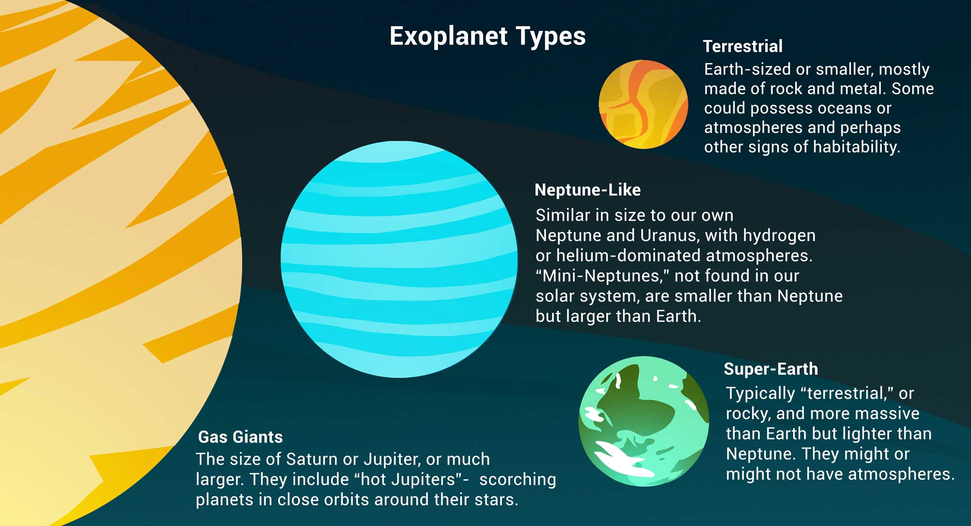
The data: exoplanets discovered by NASA 🪐
An exoplanet is a planet outside our solar system. NASA has discovered over 5,000 exoplanets so far in its search for signs of life beyond Earth. 👽
| Column | Contents |
|---|
'Distance'| Distance from Earth, in light years.
'Magnitude'| Apparent magnitude, which measures brightness in such a way that brighter objects have lower values.
'Type'| Categorization of planet based on its composition and size.
'Year'| When the planet was discovered.
'Detection'| The method of detection used to discover the planet.
'Mass'| The ratio of the planet's mass to Earth's mass.
'Radius'| The ratio of the planet's radius to Earth's radius.
exo = bpd.read_csv('data/exoplanets.csv').set_index('Name')
exo
| Distance | Magnitude | Type | Year | Detection | Mass | Radius | |
|---|---|---|---|---|---|---|---|
| Name | |||||||
| 11 Comae Berenices b | 304.0 | 4.72 | Gas Giant | 2007 | Radial Velocity | 6165.90 | 11.88 |
| 11 Ursae Minoris b | 409.0 | 5.01 | Gas Giant | 2009 | Radial Velocity | 4684.81 | 11.99 |
| 14 Andromedae b | 246.0 | 5.23 | Gas Giant | 2008 | Radial Velocity | 1525.58 | 12.65 |
| ... | ... | ... | ... | ... | ... | ... | ... |
| YZ Ceti b | 12.0 | 12.07 | Terrestrial | 2017 | Radial Velocity | 0.70 | 0.91 |
| YZ Ceti c | 12.0 | 12.07 | Super Earth | 2017 | Radial Velocity | 1.14 | 1.05 |
| YZ Ceti d | 12.0 | 12.07 | Super Earth | 2017 | Radial Velocity | 1.09 | 1.03 |
5043 rows × 7 columns
Bar charts
- How big are each of the different
'Type's of exoplanets, on average?
types = (exo
    .get(['Type', 'Mass', 'Radius', 'Magnitude', 'Distance'])
    .groupby('Type')
    .mean()
)
types
| Mass | Radius | Magnitude | Distance | |
|---|---|---|---|---|
| Type | ||||
| Gas Giant | 1472.39 | 12.74 | 10.30 | 1096.40 |
| Neptune-like | 15.28 | 3.11 | 13.52 | 2189.02 |
| Super Earth | 5.81 | 1.58 | 13.85 | 1916.26 |
| Terrestrial | 1.62 | 0.85 | 13.45 | 1373.60 |
types.plot(kind='barh', y='Radius');

types.plot(kind='barh', y='Mass');

- It looks like the
'Gas Giant's are aptly named!
Bar charts
- Bar charts visualize the relationship between a categorical variable and a numerical variable.
- In a bar chart...
- The thickness and spacing of bars is arbitrary.
- The order of the categorical labels doesn't matter.
- To create one from a DataFrame
df, use
df.plot(
    kind='barh',
    x=categorical_column_name,
    y=numerical_column_name
)
- The "h" in
'barh'stands for "horizontal".- It's easier to read labels this way.
- Note that in the previous chart, we set
y='Mass'even though mass is measured by x-axis length.
Bar charts and sorting
What are the most popular 'Detection' methods for discovering exoplanets?
# Count how many exoplanets are discovered by each detection method.
popular_detection = exo.groupby('Detection').count()
popular_detection
| Distance | Magnitude | Type | Year | Mass | Radius | |
|---|---|---|---|---|---|---|
| Detection | ||||||
| Astrometry | 1 | 1 | 1 | 1 | 1 | 1 |
| Direct Imaging | 50 | 50 | 50 | 50 | 50 | 50 |
| Disk Kinematics | 1 | 1 | 1 | 1 | 1 | 1 |
| ... | ... | ... | ... | ... | ... | ... |
| Radial Velocity | 1019 | 1019 | 1019 | 1019 | 1019 | 1019 |
| Transit | 3914 | 3914 | 3914 | 3914 | 3914 | 3914 |
| Transit Timing Variations | 23 | 23 | 23 | 23 | 23 | 23 |
11 rows × 6 columns
# Give columns more meaningful names and eliminate redundancy.
popular_detection = (popular_detection.assign(Count=popular_detection.get('Distance'))
                                      .get(['Count'])
                                      .sort_values(by='Count', ascending=False)
                    )
popular_detection
| Count | |
|---|---|
| Detection | |
| Transit | 3914 |
| Radial Velocity | 1019 |
| Direct Imaging | 50 |
| ... | ... |
| Astrometry | 1 |
| Disk Kinematics | 1 |
| Pulsar Timing | 1 |
11 rows × 1 columns
# Notice that the bars appear in the opposite order relative to the DataFrame.
popular_detection.plot(kind='barh', y='Count');

# Change "barh" to "bar" to get a vertical bar chart.
# These are harder to read, but the bars do appear in the same order as the DataFrame.
popular_detection.plot(kind='bar', y='Count');

Overlaid plots
Multiple plots on the same axes
Can we look at both the average 'Magnitude' and the average 'Radius' for each 'Type' at the same time?
exo
| Distance | Magnitude | Type | Year | Detection | Mass | Radius | |
|---|---|---|---|---|---|---|---|
| Name | |||||||
| 11 Comae Berenices b | 304.0 | 4.72 | Gas Giant | 2007 | Radial Velocity | 6165.90 | 11.88 |
| 11 Ursae Minoris b | 409.0 | 5.01 | Gas Giant | 2009 | Radial Velocity | 4684.81 | 11.99 |
| 14 Andromedae b | 246.0 | 5.23 | Gas Giant | 2008 | Radial Velocity | 1525.58 | 12.65 |
| ... | ... | ... | ... | ... | ... | ... | ... |
| YZ Ceti b | 12.0 | 12.07 | Terrestrial | 2017 | Radial Velocity | 0.70 | 0.91 |
| YZ Ceti c | 12.0 | 12.07 | Super Earth | 2017 | Radial Velocity | 1.14 | 1.05 |
| YZ Ceti d | 12.0 | 12.07 | Super Earth | 2017 | Radial Velocity | 1.09 | 1.03 |
5043 rows × 7 columns
types = (exo
    .get(['Type', 'Mass', 'Radius', 'Magnitude', 'Distance'])
    .groupby('Type')
    .mean()
)
types
| Mass | Radius | Magnitude | Distance | |
|---|---|---|---|---|
| Type | ||||
| Gas Giant | 1472.39 | 12.74 | 10.30 | 1096.40 |
| Neptune-like | 15.28 | 3.11 | 13.52 | 2189.02 |
| Super Earth | 5.81 | 1.58 | 13.85 | 1916.26 |
| Terrestrial | 1.62 | 0.85 | 13.45 | 1373.60 |
types.get(['Magnitude', 'Radius']).plot(kind='barh');

How did we do that?
Overlaying plots
When calling .plot, if we omit the y=column_name argument, all other columns are plotted.
types
| Mass | Radius | Magnitude | Distance | |
|---|---|---|---|---|
| Type | ||||
| Gas Giant | 1472.39 | 12.74 | 10.30 | 1096.40 |
| Neptune-like | 15.28 | 3.11 | 13.52 | 2189.02 |
| Super Earth | 5.81 | 1.58 | 13.85 | 1916.26 |
| Terrestrial | 1.62 | 0.85 | 13.45 | 1373.60 |
types.plot(kind='barh');

Selecting multiple columns at once
Remember, to select multiple columns, use .get([column_1, ..., column_k]). This returns a DataFrame.
types
| Mass | Radius | Magnitude | Distance | |
|---|---|---|---|---|
| Type | ||||
| Gas Giant | 1472.39 | 12.74 | 10.30 | 1096.40 |
| Neptune-like | 15.28 | 3.11 | 13.52 | 2189.02 |
| Super Earth | 5.81 | 1.58 | 13.85 | 1916.26 |
| Terrestrial | 1.62 | 0.85 | 13.45 | 1373.60 |
types.get(['Magnitude', 'Radius'])
| Magnitude | Radius | |
|---|---|---|
| Type | ||
| Gas Giant | 10.30 | 12.74 |
| Neptune-like | 13.52 | 3.11 |
| Super Earth | 13.85 | 1.58 |
| Terrestrial | 13.45 | 0.85 |
types.get(['Magnitude', 'Radius']).plot(kind='barh');
Recipe 👩🍳
How to make an overlaid plot:
.getonly the columns that contain information relevant to your plot (or, equivalently,.dropall extraneous columns).- Specify the column for the $x$-axis (if not the index) in
.plot(x=column_name). - Omit the
yargument. Then all other columns will be plotted on a shared $y$-axis.
Distributions
What is the distribution of a variable?
- The distribution of a variable consists of all values of the variable that occur in the data, along with their frequencies.
- Distributions help you understand:
How often does a variable take on a certain value?
- Both categorical and numerical variables have distributions.
Distributions of categorical variables
The distribution of a categorical variable can be displayed as a table or bar chart, among other ways!
For example, let's look at the distribution of exoplanet 'Type's. To do so, we'll need to group.
# Remember, when we group and use .count(), the column names aren't meaningful.
type_counts = exo.groupby('Type').count()
type_counts
| Distance | Magnitude | Year | Detection | Mass | Radius | |
|---|---|---|---|---|---|---|
| Type | ||||||
| Gas Giant | 1480 | 1480 | 1480 | 1480 | 1480 | 1480 |
| Neptune-like | 1793 | 1793 | 1793 | 1793 | 1793 | 1793 |
| Super Earth | 1577 | 1577 | 1577 | 1577 | 1577 | 1577 |
| Terrestrial | 193 | 193 | 193 | 193 | 193 | 193 |
# As a result, we could have set y='Magnitude', for example, and gotten the same plot.
type_counts.plot(kind='barh', y='Distance',
                 legend=False, title='Distribution of Exoplanet Types');

Notice the optional title argument. Some other useful optional arguments are legend, figsize, xlabel, and ylabel. There are many optional arguments.
It looks like terrestrial exoplanets are the most rare in the dataset. They also have the smallest average radius of any 'Type'.
types
| Mass | Radius | Magnitude | Distance | |
|---|---|---|---|---|
| Type | ||||
| Gas Giant | 1472.39 | 12.74 | 10.30 | 1096.40 |
| Neptune-like | 15.28 | 3.11 | 13.52 | 2189.02 |
| Super Earth | 5.81 | 1.58 | 13.85 | 1916.26 |
| Terrestrial | 1.62 | 0.85 | 13.45 | 1373.60 |
Let's look into them further!
Terrestrial exoplanets 🌑
terr = exo[exo.get('Type') == 'Terrestrial']
terr
| Distance | Magnitude | Type | Year | Detection | Mass | Radius | |
|---|---|---|---|---|---|---|---|
| Name | |||||||
| EPIC 201497682 b | 825.0 | 13.95 | Terrestrial | 2019 | Transit | 0.26 | 0.69 |
| EPIC 201757695.02 | 1884.0 | 14.97 | Terrestrial | 2020 | Transit | 0.69 | 0.91 |
| EPIC 201833600 c | 840.0 | 14.71 | Terrestrial | 2019 | Transit | 0.97 | 1.00 |
| ... | ... | ... | ... | ... | ... | ... | ... |
| TRAPPIST-1 e | 41.0 | 17.02 | Terrestrial | 2017 | Transit | 0.69 | 0.92 |
| TRAPPIST-1 h | 41.0 | 17.02 | Terrestrial | 2017 | Transit | 0.33 | 0.76 |
| YZ Ceti b | 12.0 | 12.07 | Terrestrial | 2017 | Radial Velocity | 0.70 | 0.91 |
193 rows × 7 columns
Let's focus on the 'Radius' column of terr. To learn more about it, we can use the .describe() method.
terr.get('Radius').describe()
count    193.00
mean       0.85
std        0.26
          ...
50%        0.86
75%        0.92
max        3.13
Name: Radius, Length: 8, dtype: float64
But how do we visualize its distribution?
Visualizing the distribution of 'Radius', a numerical variable
- A few slides ago, we looked at the distribution of
'Type', which is a categorical variable. - Now, we'll look at the distribution of
'Radius', which is a numerical variable. - As we'll see, a bar chart is not the right choice of visualization for the distribution of a numerical variable.
To try and see the distribution of 'Radius', we need to group by that column and count how many terrestrial planets there are of each radius.
terr_radius = terr.groupby('Radius').count()
terr_radius = (terr_radius
                 .assign(Count=terr_radius.get('Distance'))
                 .get(['Count'])
              )
terr_radius
| Count | |
|---|---|
| Radius | |
| 0.37 | 1 |
| 0.40 | 1 |
| 0.47 | 1 |
| ... | ... |
| 1.80 | 1 |
| 2.85 | 1 |
| 3.13 | 1 |
85 rows × 1 columns
terr_radius.plot(kind='bar', y='Count', figsize=(15, 5));

The horizontal axis should be numerical (like a number line), not categorical. There should be more space between certain bars than others.
For instance, the planet with 'Radius' 1.8 is 80% larger than the planet with 'Radius' 1, but they appear to be about the same size here.
Density histograms
Density histograms show the distribution of numerical variables
Instead of a bar chart, we'll visualize the distribution of a numerical variable with a density histogram. Let's see what a density histogram for 'Radius' looks like. What do you notice about this visualization?
# Ignore the code for right now.
terr.plot(kind='hist', y='Radius', density=True, bins = np.arange(0, 3.5, 0.25), ec='w');

# There are 7 terrestrial exoplanets with a radius of exactly 1.0,
# but the height of the bar starting at 1.0 is not 7!
terr[terr.get('Radius') == 1]
| Distance | Magnitude | Type | Year | Detection | Mass | Radius | |
|---|---|---|---|---|---|---|---|
| Name | |||||||
| EPIC 201833600 c | 840.0 | 14.71 | Terrestrial | 2019 | Transit | 0.97 | 1.0 |
| EPIC 206215704 b | 358.0 | 17.83 | Terrestrial | 2019 | Transit | 0.97 | 1.0 |
| K2-157 b | 973.0 | 12.94 | Terrestrial | 2018 | Transit | 0.97 | 1.0 |
| K2-239 c | 101.0 | 14.63 | Terrestrial | 2018 | Transit | 0.97 | 1.0 |
| Kepler-1417 b | 3235.0 | 14.04 | Terrestrial | 2016 | Transit | 0.97 | 1.0 |
| Kepler-1464 c | 3757.0 | 14.36 | Terrestrial | 2016 | Transit | 0.97 | 1.0 |
| Kepler-392 b | 2223.0 | 13.53 | Terrestrial | 2014 | Transit | 0.97 | 1.0 |
First key idea behind histograms: Binning 🗑️
- Binning is the act of counting the number of numerical values that fall within ranges defined by two endpoints. These ranges are called “bins”.
- A value falls in a bin if it is greater than or equal to the left endpoint and less than the right endpoint.
- [a, b): a is included, b is not.
- The width of a bin is its right endpoint minus its left endpoint.
binning_animation()
Plotting a density histogram
- Density histograms (not bar charts!) visualize the distribution of a single numerical variable by placing numbers into bins.
- To create one from a DataFrame
df, use
df.plot(
    kind='hist',
    y=column_name,
    density=True
)
- Optional but recommended: Use
ec='w'to see where bins start and end more clearly (edge color = white).
Customizing the bins
- By default, Python will bin your data into 10 equally sized bins.
- You can specify another number of equally sized bins by setting the optional argument
binsequal to some other integer value. - You can also specify custom bin start and endpoints by setting
binsequal to a list or array of bin endpoints.
# There are 10 bins by default, some of which are empty.
terr.plot(kind='hist', y='Radius', density=True, ec='w');

terr.plot(kind='hist', y='Radius', density=True, bins=20, ec='w');

terr.plot(kind='hist', y='Radius', density=True, bins=[0, 0.5, 1, 1.5, 2, 2.5, 3, 3.5], ec='w');

In the three histograms above, what is different and what is the same?
Observations
- The general shape of all three histograms is the same, regardless of the bins.
- More bins gives a finer, more granular picture of the distribution of the variable
'Radius'. - The $y$-axis values seem to change a lot when we change the bins. Hang onto that thought; we'll see why shortly.
Bin details
- In a histogram, only the last bin is inclusive of the right endpoint!
- The bins you specify don't have to include all data values; data values not in any bin won't be shown in the histogram.
- For equally sized bins, use
np.arange.- Be very careful with the endpoints.
- For example,
bins=np.arange(4)creates the bins [0, 1), [1, 2), [2, 3].
- Bins can have different sizes!
terr.plot(kind='hist', y='Radius', density=True,
            bins=np.arange(0, 3.5, 0.5),
            ec='w');

terr.sort_values('Radius', ascending=False)
| Distance | Magnitude | Type | Year | Detection | Mass | Radius | |
|---|---|---|---|---|---|---|---|
| Name | |||||||
| Kepler-33 c | 3944.0 | 14.10 | Terrestrial | 2011 | Transit | 0.39 | 3.13 |
| K2-138 f | 661.0 | 12.25 | Terrestrial | 2017 | Transit | 1.63 | 2.85 |
| Kepler-11 b | 2108.0 | 13.82 | Terrestrial | 2010 | Transit | 1.90 | 1.80 |
| ... | ... | ... | ... | ... | ... | ... | ... |
| Kepler-102 b | 352.0 | 12.07 | Terrestrial | 2014 | Transit | 4.30 | 0.47 |
| Kepler-444 b | 119.0 | 8.87 | Terrestrial | 2015 | Transit | 0.04 | 0.40 |
| Kepler-37 e | 209.0 | 9.77 | Terrestrial | 2014 | Transit Timing Variations | 0.03 | 0.37 |
193 rows × 7 columns
In the above example, the terrestrial exoplanet with the largest radius (Kepler-33 c) is not included because the rightmost bin is [2.5, 3.0] and Kepler-33 c has a 'Radius' of 3.13.
terr.plot(kind='hist', y='Radius', density=True,
          bins=[0, 0.25, 0.5, 0.75, 2, 4], ec='w');

In the above example, the bins have different widths!
Second key idea behind histograms: Total area is 1
- In a density histogram, the $y$-axis can be hard to interpret, but it's designed to give the histogram a very nice property:
The bars of a density histogram
have a combined total area of 1.
- Important: The area of a bar is equal to the proportion of all data points that fall into that bin.
- Recall from the pretest, proportions and percentages represent the same thing.
- A proportion is a decimal between 0 and 1, a percentage is between 0% and 100%.
- The proportion 0.34 means 34%.
Example calculation
terr.plot(kind='hist', y='Radius', density=True,
          bins=[0, 0.25, 0.5, 0.75, 2, 4], ec='w');
Based on this histogram, what proportion of terrestrial exoplanets have a 'Radius' between 0.5 and 0.75?
Example calculation
The height of the [0.5, 0.75) bar looks to be around 0.8.
The width of the bin is 0.75 - 0.5 = 0.25.
Therefore, using the formula for the area of a rectangle,
$$\begin{align}\text{Area} &= \text{Height} \times \text{Width} \\ &= 0.8 \times 0.25 \\ &= 0.2 \end{align}$$
- Since areas represent proportions, this means that the proportion of terrestrial exoplanets with a radius between 0.5 and 0.75 is about 0.2 (or 20%).
Check the math 🧮
in_range = terr[(terr.get('Radius') >= 0.5) & (terr.get('Radius') < 0.75)].shape[0]
in_range
39
in_range / terr.shape[0]
0.20207253886010362
This matches the result we got. (Not exactly, since we made an estimate for the height.)
Calculating heights in a density histogram
Since a bar of a histogram is a rectangle, its area is given by
$$\text{Area} = \text{Height} \times \text{Width}$$
That means
$$\text{Height} = \frac{\text{Area}}{\text{Width}} = \frac{\text{Proportion (or Percentage)}}{\text{Width}}$$
This implies that the units for height are "proportion per ($x$-axis unit)". The $y$-axis represents a sort of density, which is why we call it a density histogram.
terr.plot(kind='hist', y='Radius', density=True,
          bins=[0, 0.25, 0.5, 0.75, 2, 4], ec='w');
The $y$-axis units here are "proportion per radius", since the $x$-axis represents radius.
- Unfortunately, the $y$-axis units on the histogram always displays as "Frequency". This is wrong!
- We can fix this with the optional argument
ylabelbut we usually don't.
Concept Check ✅ – Answer at cc.dsc10.com
Suppose we created a density histogram of people's shoe sizes. 👟 Below are the bins we chose along with their heights.
| Bin | Height of Bar |
|---|---|
| [3, 7) | 0.05 |
| [7, 10) | 0.1 |
| [10, 12) | 0.15 |
| [12, 16] | $X$ |
What should the value of $X$ be so that this is a valid histogram?
A. 0.02 B. 0.05 C. 0.2 D. 0.5 E. 0.7
✅ Click here to see an explanation after you've answered.
From the provided bins, we can calculate the bin widths, and then multiply each bin's width by its height to find its area. The bin $[3, 7)$ has a width of $7-3=4$ and a height of $0.05$, so its area is $4*0.05 = 0.2$. Similarly, the bin $[7, 10)$ has an area of $3*0.1 = 0.3$ and the bin $[10, 12)$ has an area of $2*0.15 = 0.3$.
Adding these up, the total area of the first three bins is $0.2+0.3+0.3=0.8$, and since the total area of all bins in a histogram is always $1$, the fourth bin must have an area of $0.2$. This bin has a width of $4$, so its height must be $0.05$ to make its area $0.2$.
Review: Types of visualizations
The type of visualization we create depends on the kinds of variables we're visualizing.
- Scatter plot: Numerical vs. numerical.
- Example: Weight vs. height.
- Line plot: Sequential numerical (time) vs. numerical.
- Example: Height vs. time.
- Bar chart: Categorical vs. numerical.
- Example: Heights of different family members.
- Histogram: Distribution of numerical.
We may interchange the words "plot", "chart", and "graph"; they all mean the same thing.
Bar charts vs. histograms
| Bar chart | Histogram |
|---|---|
| Shows the distribution of a categorical variable | Shows the distribution of a numerical variable |
| Plotted from 2 columns of a DataFrame | Plotted from 1 column of a DataFrame |
| 1 categorical axis, 1 numerical axis | 2 numerical axes |
| Bars have arbitrary, but equal, widths and spacing | Horizontal axis is numerical and to scale |
| Lengths of bars are proportional to the numerical quantity of interest | Height measures density; areas are proportional to the proportion (percent) of individuals |
🌟 Important 🌟
In this class, "histogram" will always mean a "density histogram". We will only use density histograms.
Note: It's possible to create what's called a frequency histogram where the $y$-axis simply represents a count of the number of values in each bin.
While easier to interpret, frequency histograms don't have the important property that the total area is 1, so they can't be connected to probability in the same way that density histograms can. This property will be useful to us later on in the course.
Extra Practice
Another example: Heights of children and their parents 👪 📏
- The data below was collected in the late 1800s by Francis Galton.
- He was a eugenicist and proponent of scientific racism, which is why he collected this data.
- Today, we understand that eugenics is immoral, and that there is no scientific evidence or any other justification for racism.
- We will revisit this dataset later on in the course.
- For now, we'll only need the
'mother', and'child'columns.
mother_child = bpd.read_csv('data/galton.csv').get(['mother', 'child'])
mother_child
| mother | child | |
|---|---|---|
| 0 | 67.0 | 73.2 |
| 1 | 67.0 | 69.2 |
| 2 | 67.0 | 69.0 |
| ... | ... | ... |
| 931 | 66.0 | 61.0 |
| 932 | 63.0 | 66.5 |
| 933 | 63.0 | 57.0 |
934 rows × 2 columns
Plotting overlaid histograms
alpha controls how transparent the bars are (alpha=1 is opaque, alpha=0 is transparent).
height_bins = np.arange(55, 80, 2.5)
mother_child.plot(kind='hist', density=True, ec='w',
                  alpha=0.65, bins=height_bins);

Why do children seem so much taller than their mothers?
Extra Practice
Try to answer these questions based on the overlaid histogram.
What proportion of children were between 70 and 75 inches tall?
What proportion of mothers were between 60 and 63 inches tall?
✅ Click here to see the answers to the problems above after you've tried them on your own.
Question 1
The height of the $[70, 72.5)$ bar is around $0.08$, meaning that $0.08 \cdot 2.5 = 0.2$ of children had heights in that interval. The height of the $[72.5, 75)$ bar is around $0.02$, meaning $0.02 \cdot 2.5 = 0.05$ of children had heights in that interval. Thus, the overall proportion of children who were between $70$ and $75$ inches tall was around $0.20 + 0.05 = 0.25$, or $25\%$. This is a bit of an overestimate, since neither bar was quite as tall as our estimate.
To verify our answer, we can run
mother_child[(mother_child.get('child') >= 70) & (mother_child.get('child') < 75)].shape[0] / mother_child.shape[0]
Question 2
We can't tell. We could try and breaking it up into the proportion of mothers in $[60, 62.5)$ and $[62.5, 63)$, but we don't know the latter. In the absence of any additional information, we can't infer about the distribution of values within a bin. For example, it could be that everyone in the interval $[62.5, 65)$ actually falls in the interval $[62.5, 63)$ - or it could be that no one does!
Summary and Break
Summary
- Histograms (not bar charts!) are used to display the distribution of a numerical variable.
- We will always use density histograms in this course.
- In a density histogram, the area of a bar represents the proportion (percentage) of values within its bin.
- The total area of all bars is 1 (100%).
- We can overlay multiple line plots, bar charts, and histograms on top of one another to look at multiple relationships or distributions.
After the Break
- Writing our own functions.
- Applying functions to the data in a DataFrame.